Bringing doctors closer
Bringing doctors
closer
SYMPAD pharmacy-based
e-health app UX
A medical safe space for a vulnerable population
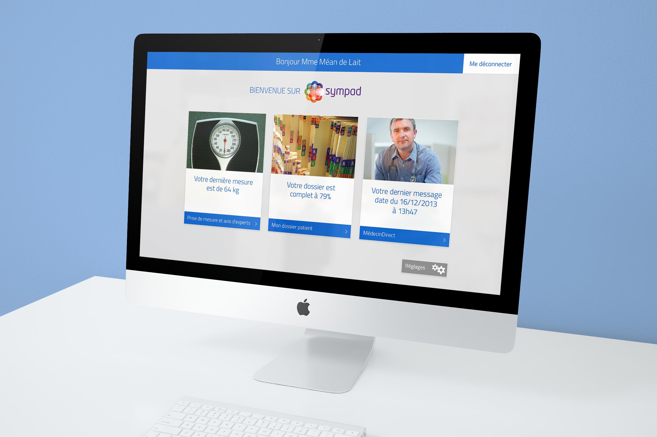
France has a doctor problem. There are too few to go around, with rural and industrial towns increasingly disconnected from quality care. At a time when the population of small towns and villages is ageing rapdily, the medical system they now need is often far away, expensive, and overwhelmed. French telemedecine start-up MédecinDirect was already building a system for remote monitoring of patients, but knew that the older generation would not feel comfortable with much of the technology that younger users took for granted. Rather than a smartphone app or website, the decision was to create SYMPAD, a simplified interface that would be installed in local pharamcies and connect to doctors using MédecinDirect's secure system.
App, portal, or website?
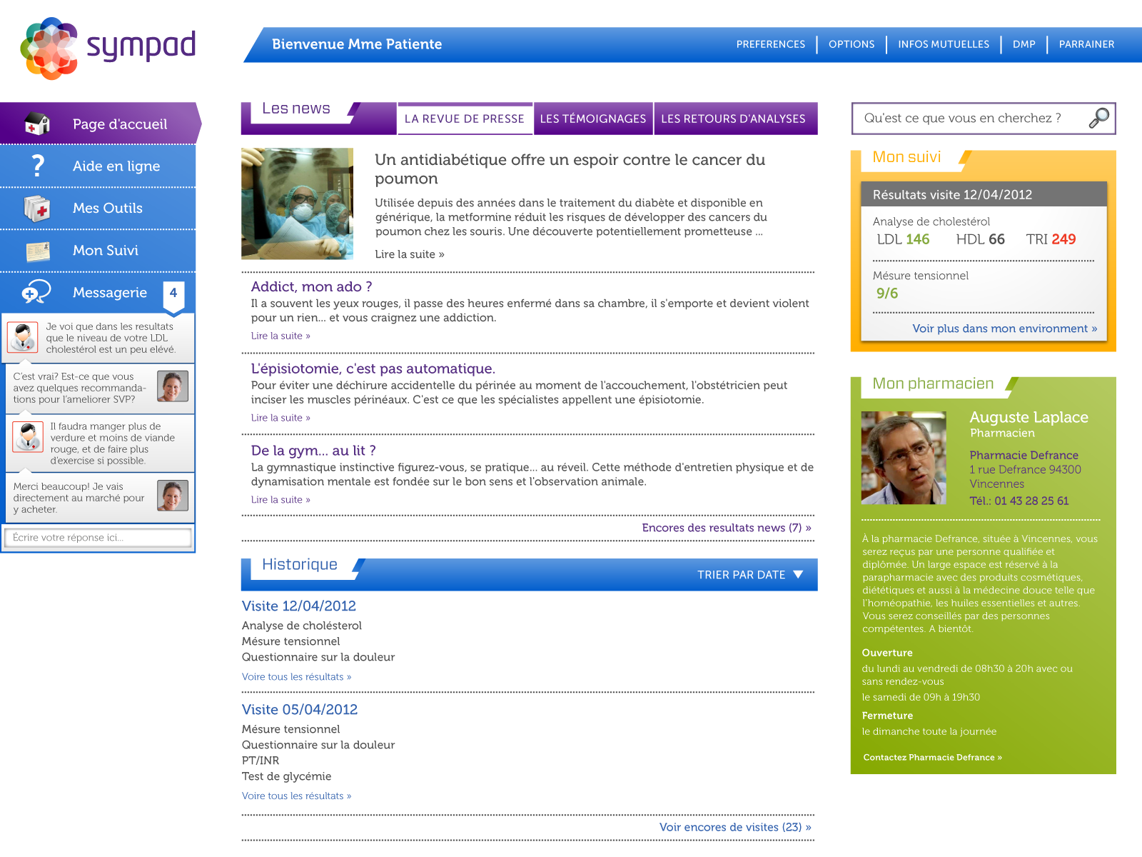
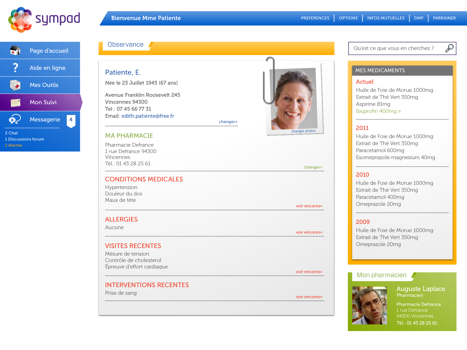
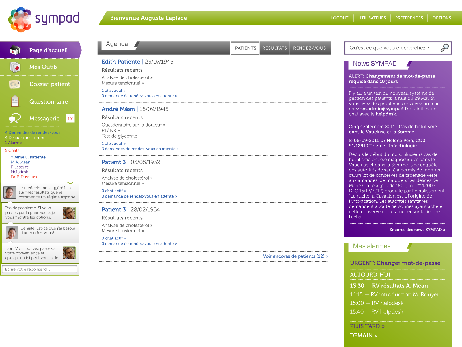
As early as 2012, I had designed early concepts for an "online medical record and follow-up system" for SYMPAD, before the final decision to install the system in pharmacies was made. Initial exploration of the concept was as a desktop app with Patient, Doctor, and Pharmacist portals for the different user bases. The final user experience kept the "3-view" model, but the Patient portal was designed specifically for touchscreen PCs set up in pharmacies, while the Pharmacist and Doctor portals were intended for normal desktop/laptop use as well.
Oversized and uncluttered
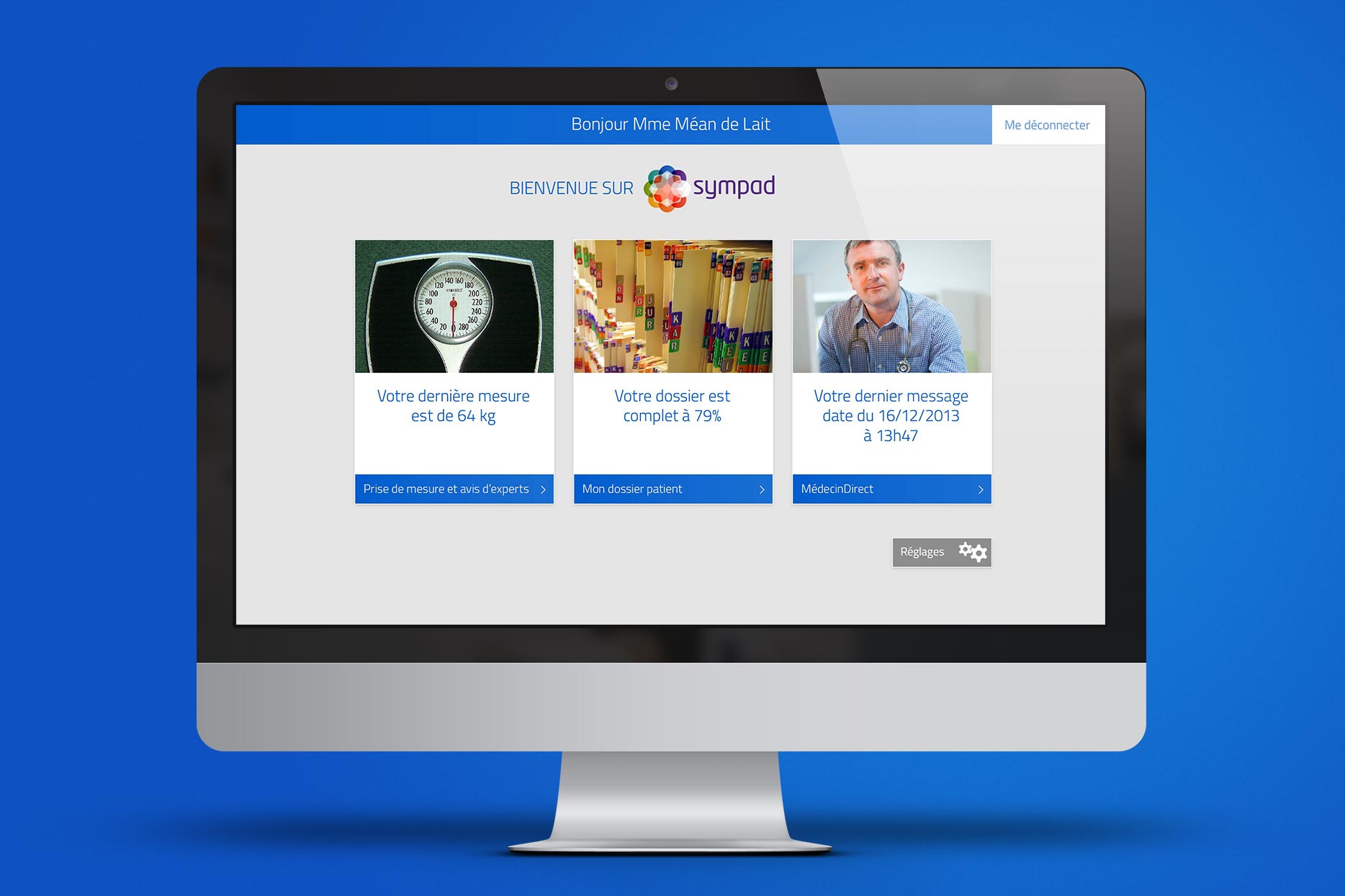
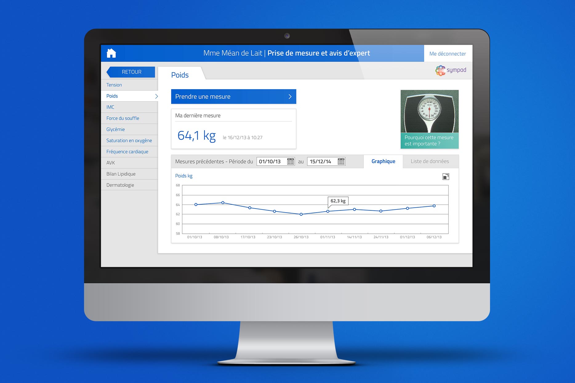
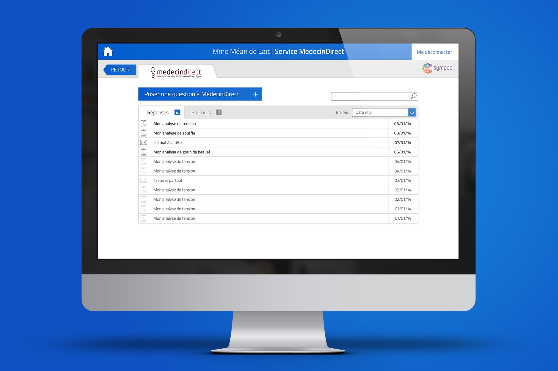
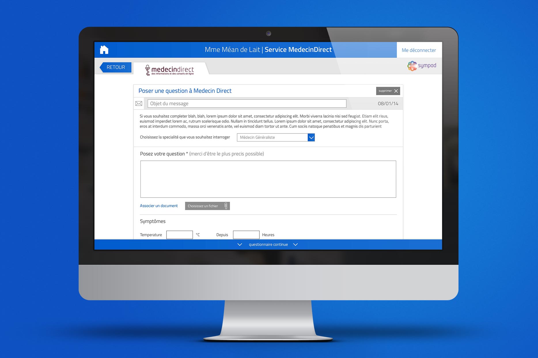
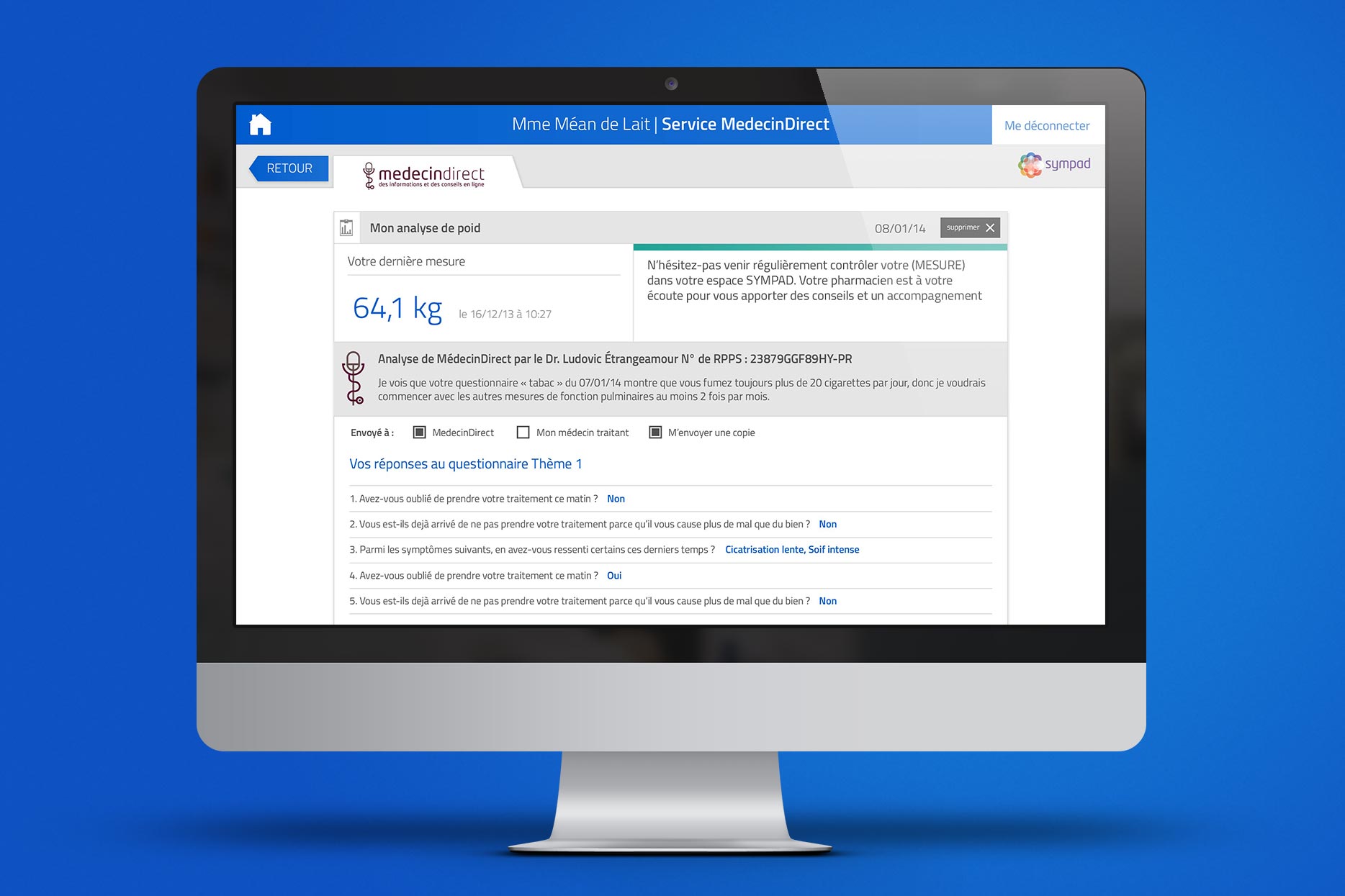
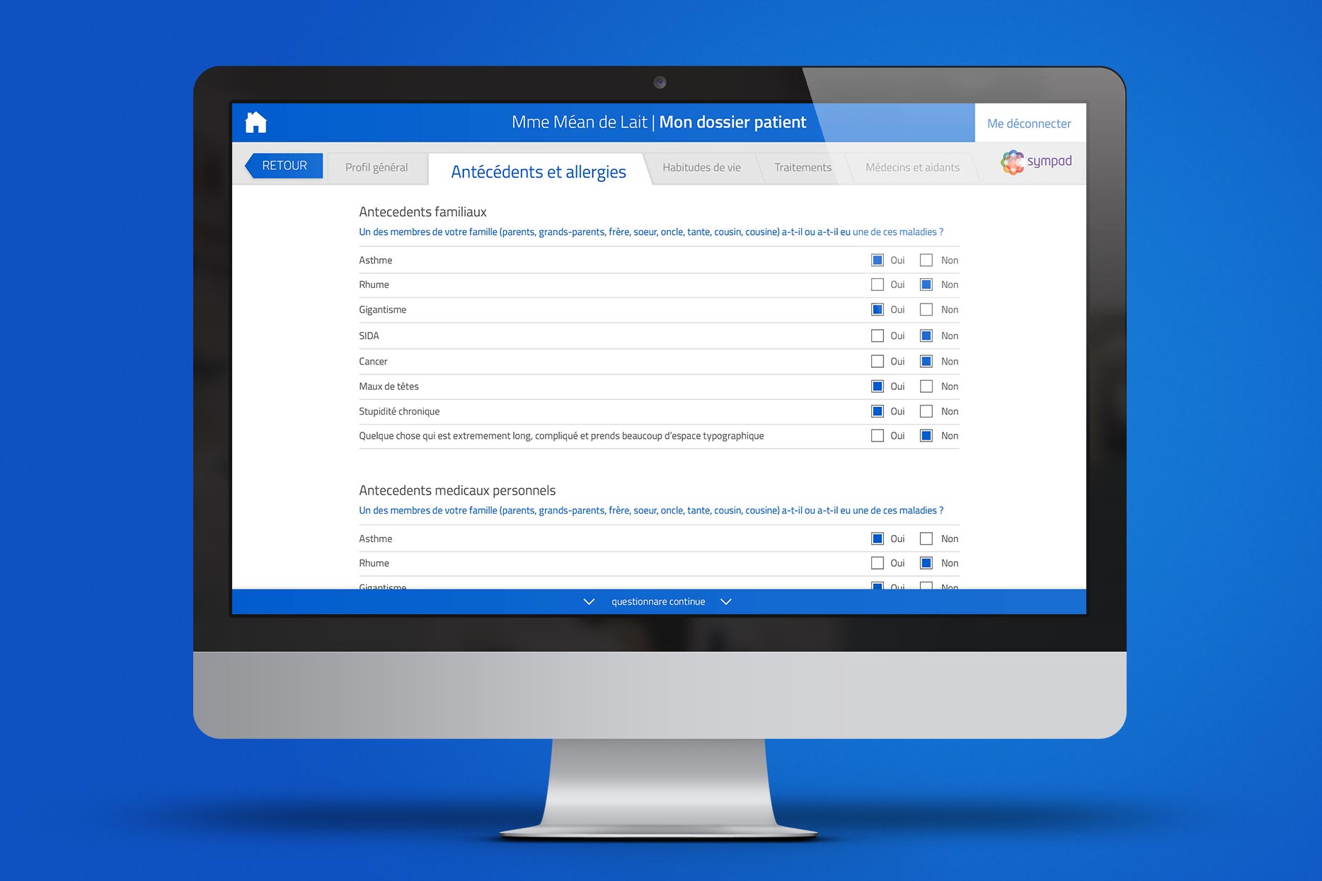
Knowing that the initial user base would be older and likely less computer savvy, it was decided that the interface should be made as easy to read and use as possible. The user interface was stripped to its core functionality, with information displayed in a familiar tab format. Each page was then designed to walk the patient through the necessary steps to take measurements, communicate with doctors, or understand their results. Since the primary application of the software would be on touchscreen desktop PCs, buttons and controls were designed with large and easy to hit targets, even for an unsteady hand.
Color coded
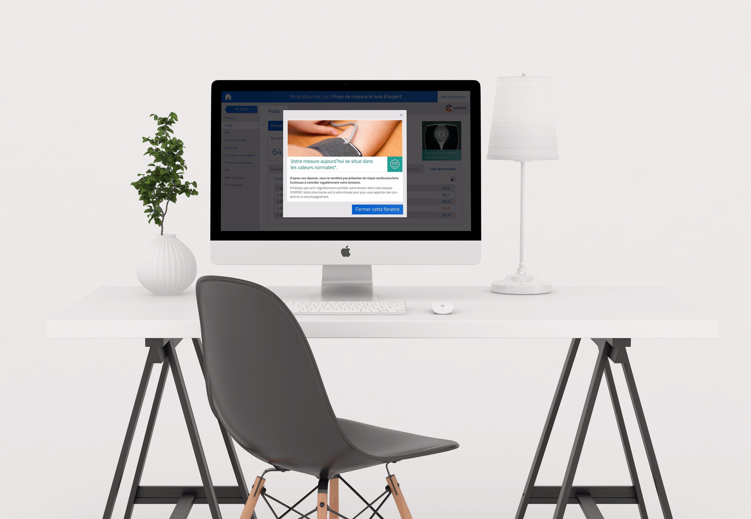
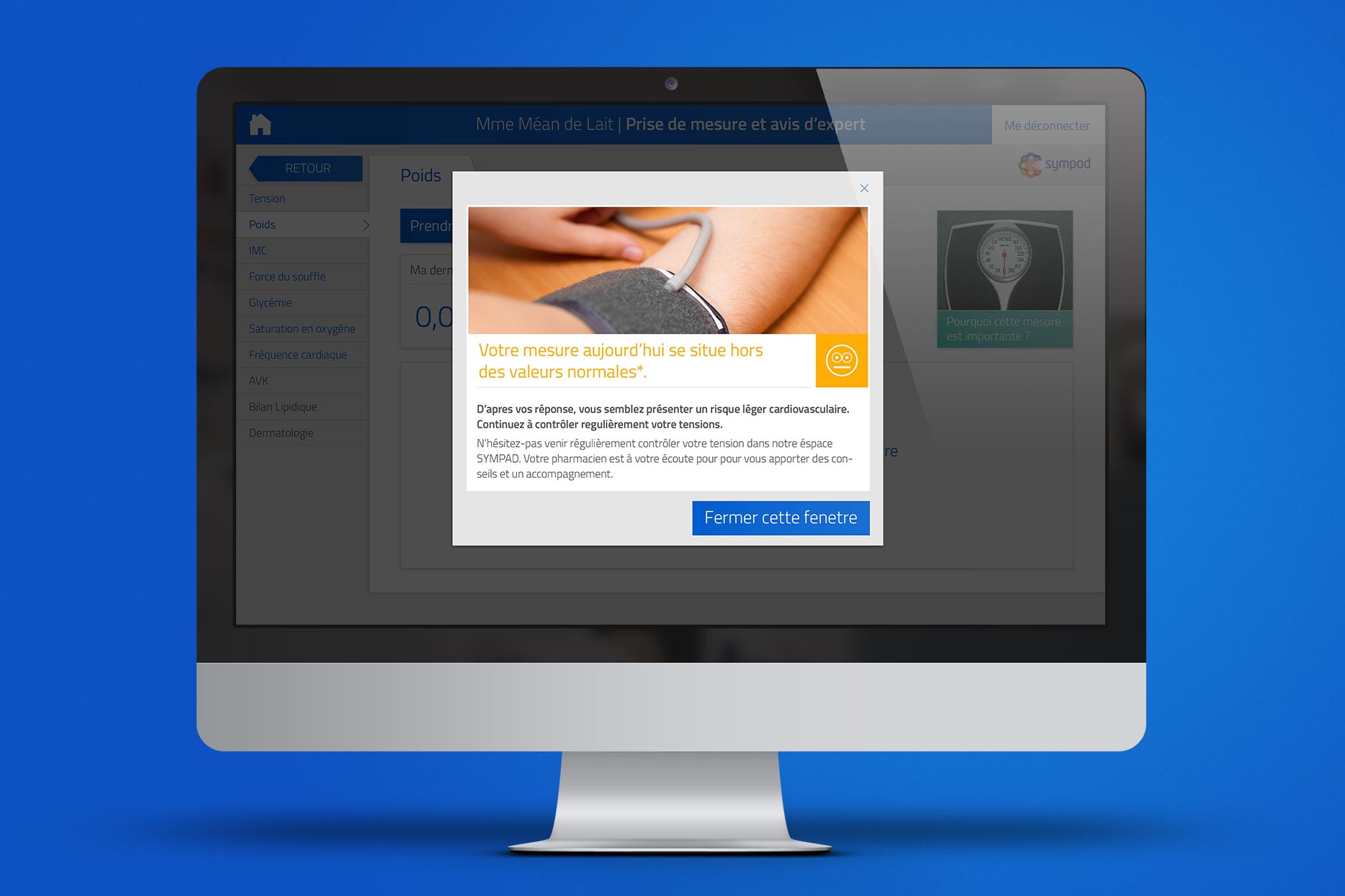
Color was used sparingly to help users quickly find key information that was needed for their sessions. A bright blue was used for all Patient-related operations and key measurements, as this allowed for strong contrast and would be largely unaffected by the most common types of color blindness. While a standard green/yellow/red color scheme was used for alerts and feedback, this information was also accompanied by simple emoticons to ensure clarity for patients.
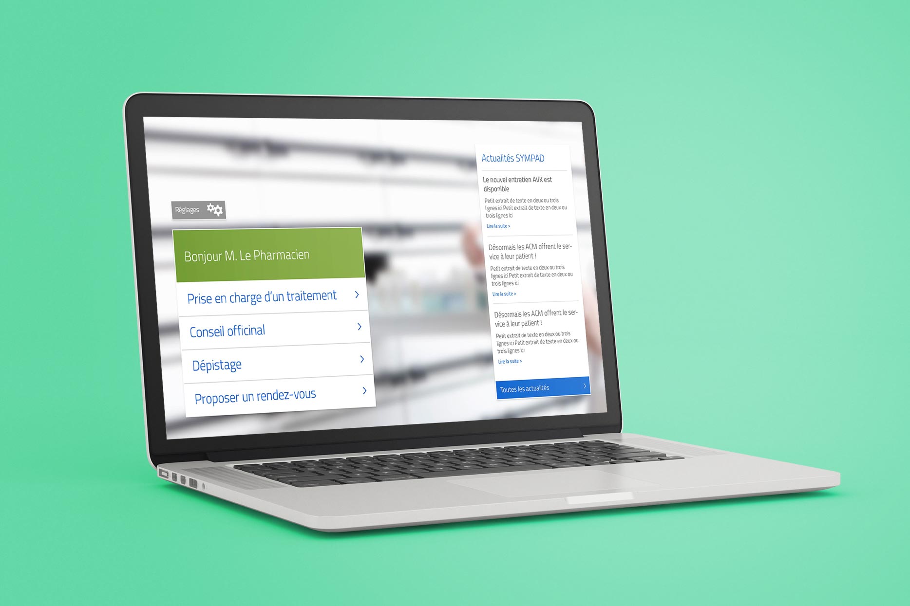
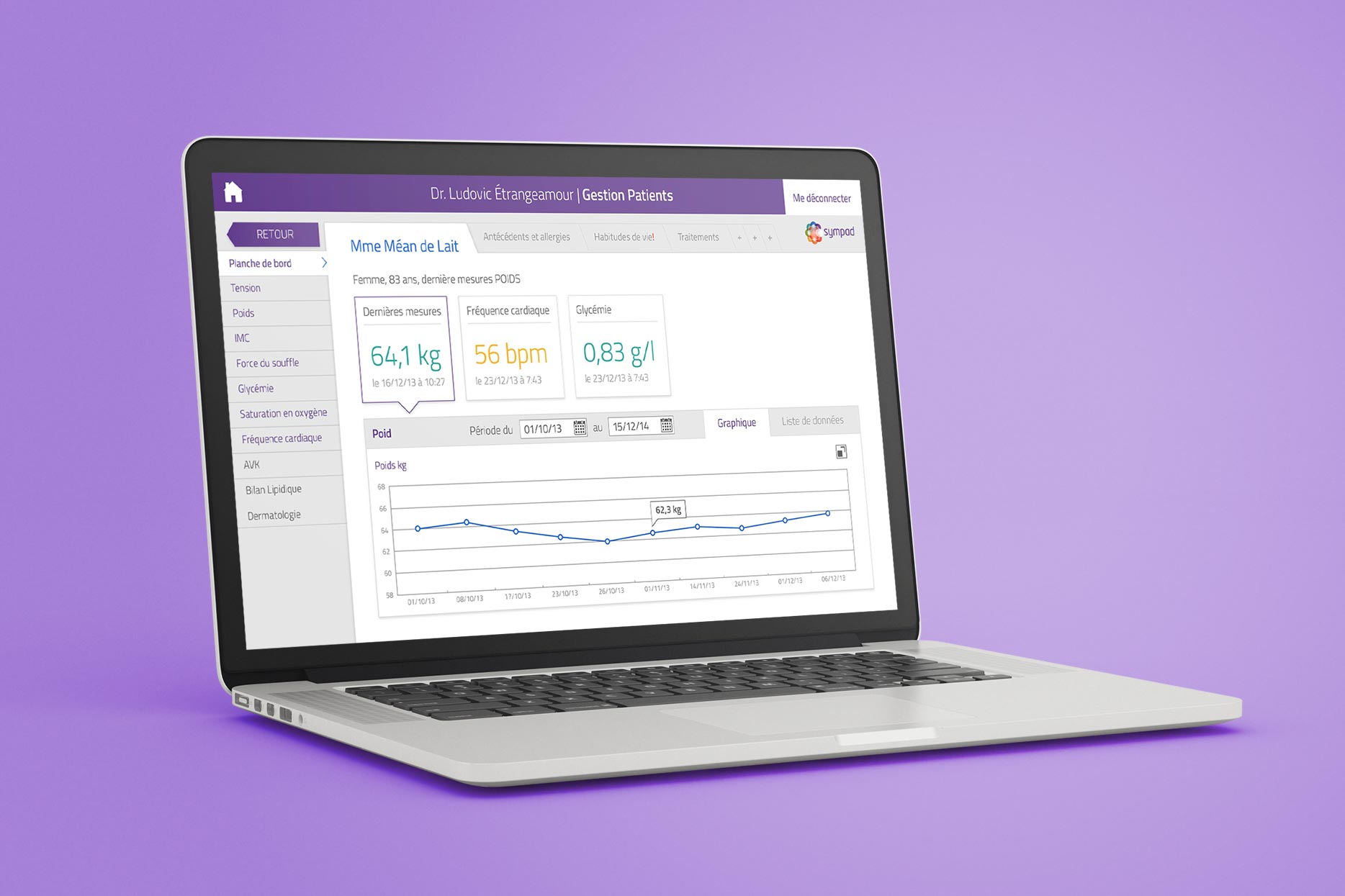
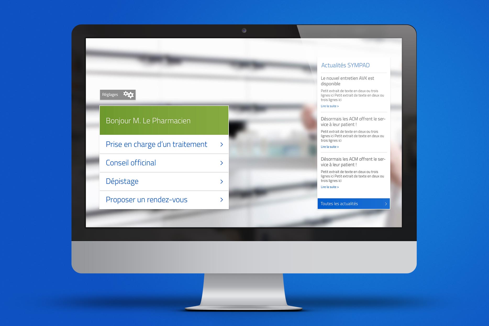
To help pharmacists and doctors avoid accidentally using the Patient portal (for privacy and security reasons), we used a different color scheme for the primary interface elements such as the header, login windows and welcome screens. A green theme was chosen for the Pharmacy portal (a color commonly associated with pharmacies in France) and purple (a distinctive brand color) for the Doctor portal, while patient-related content continued to use the strong blue color for quick parsing of data.
The teal green "good result" color is accompanied by a "happy" emoticon in order to aid understanding by users with visual impairment
A helping hand
As a result of the installation of the SYMAD system in pharmacies across France, thousands of patients have been given a chance to improve their health and well-being in the comfort of their own local pharmacy. By creating a system that is simple to learn and use, we have allowed pharmacists to extend the reach of their business without complex training or fiddly backend interfaces of many bespoke systems. Telemedicine may be the future, but SYMPAD has enabled better health at a distance today.
As a result of the installation of the SYMPAD system in pharmacies across France, thousands of patients have been given a chance to improve their health and well-being in the comfort of their own local pharmacy. By creating a system that is simple to learn and use, we have allowed pharmacists to extend the reach of their business without complex training or fiddly backend interfaces of many bespoke systems. Telemedicine may be the future, but SYMPAD has enabled better health at a distance today.

Some of my other projects
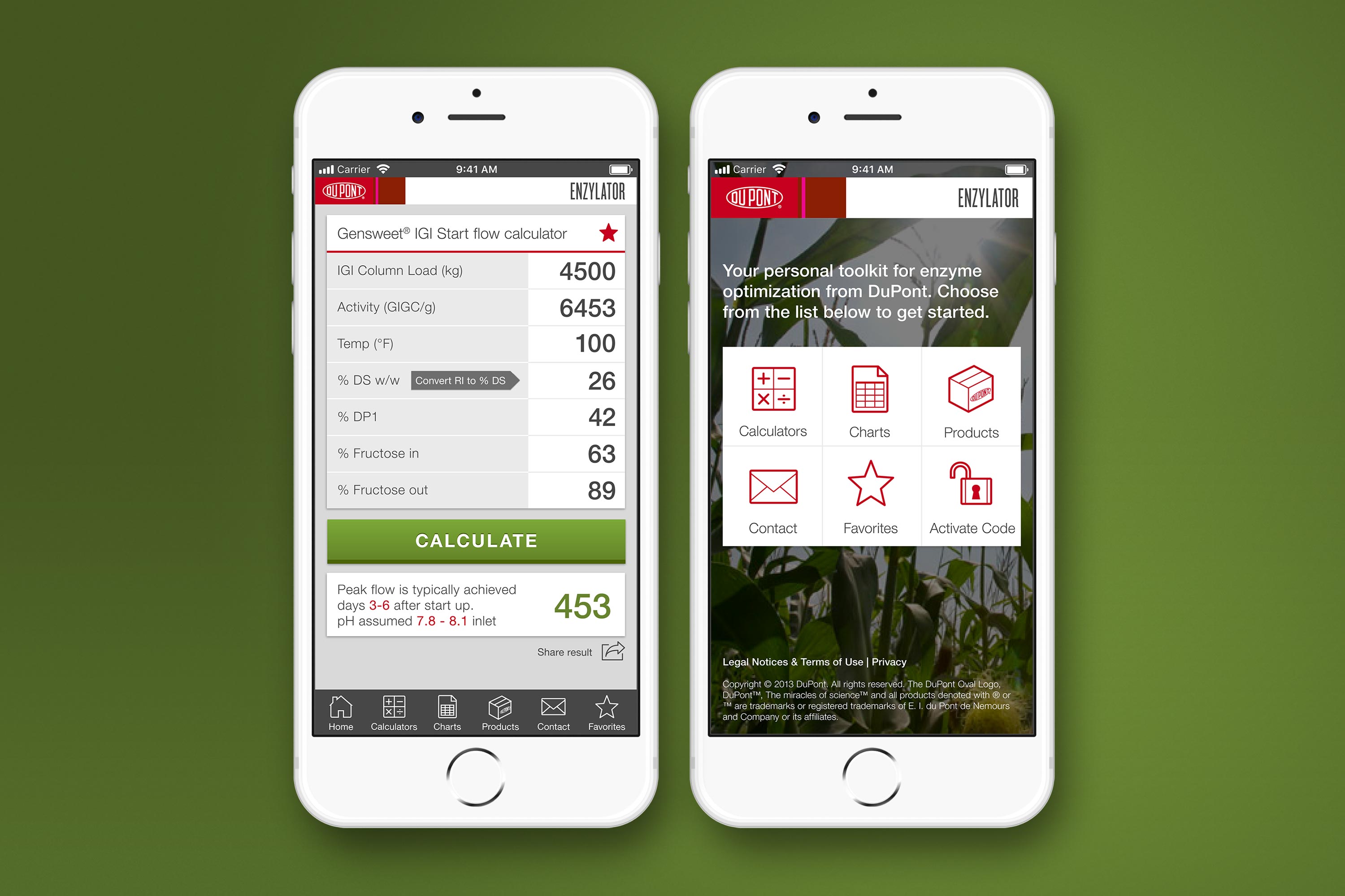
DuPont Enzylator AppUX Design
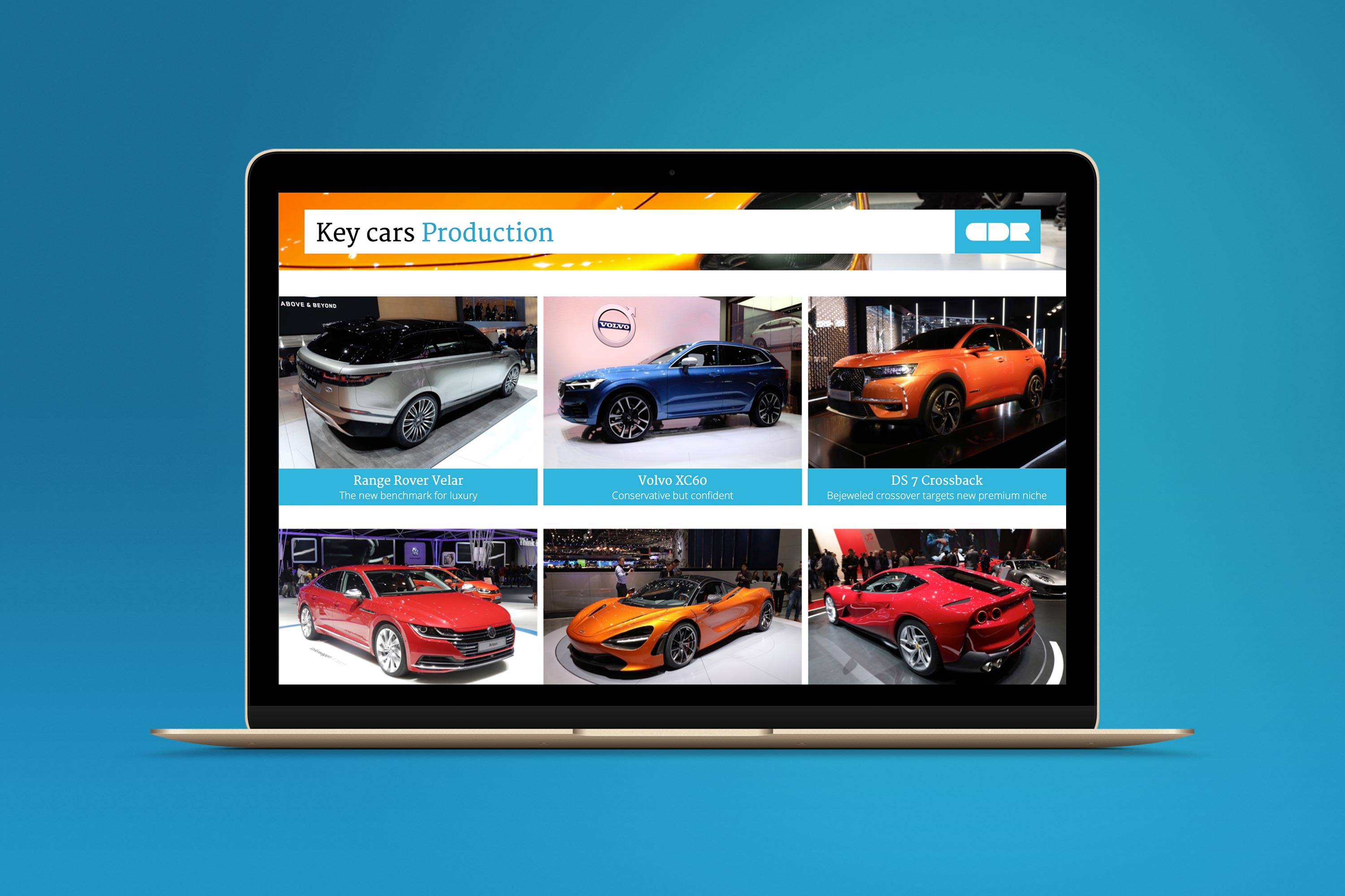
Car Design Research Design SystemUX, Branding, Presentation Design
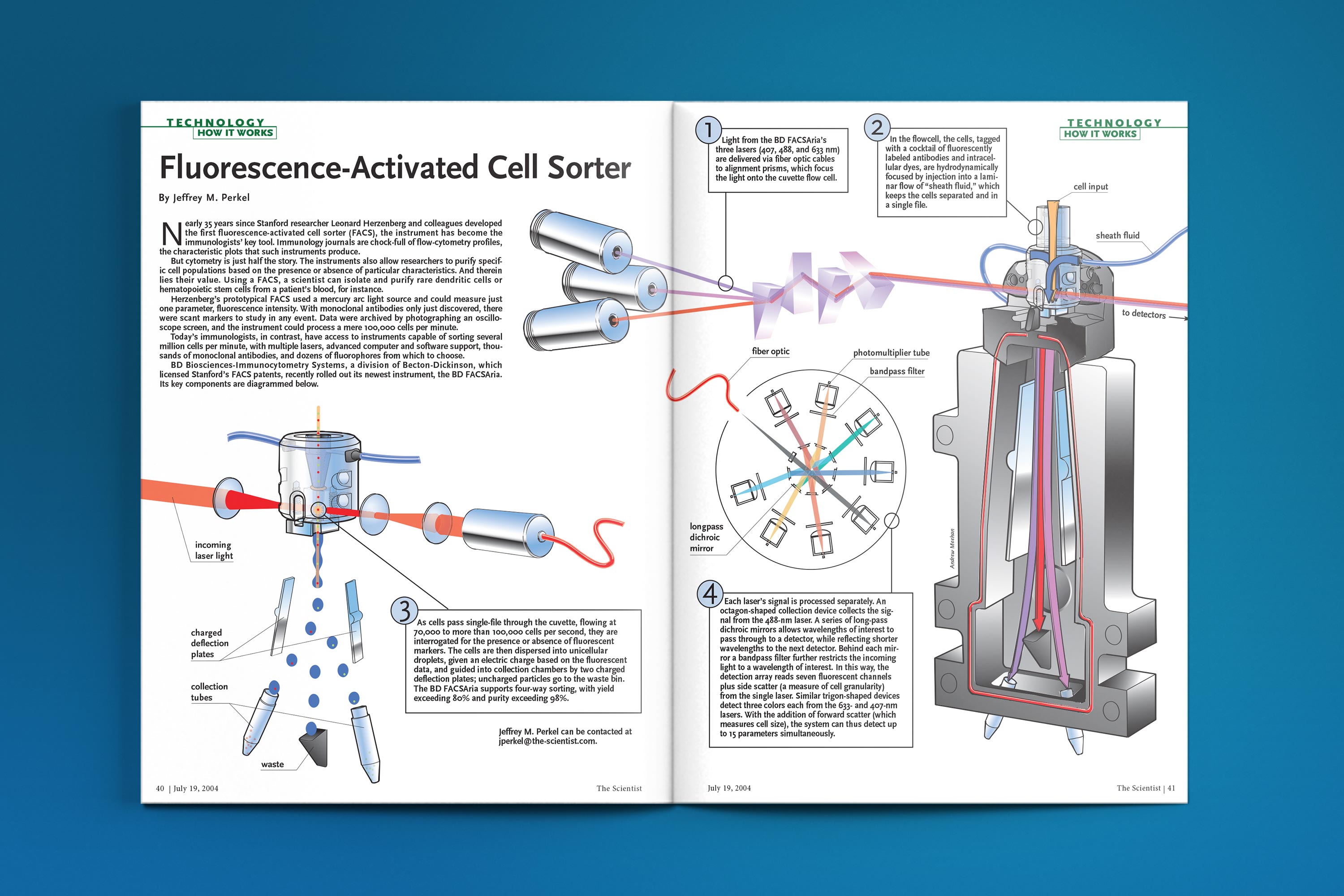
The Scientist - How It WorksTechnical Illustration
DuPont Industrial Biosciences websiteUser Experience, Product Design
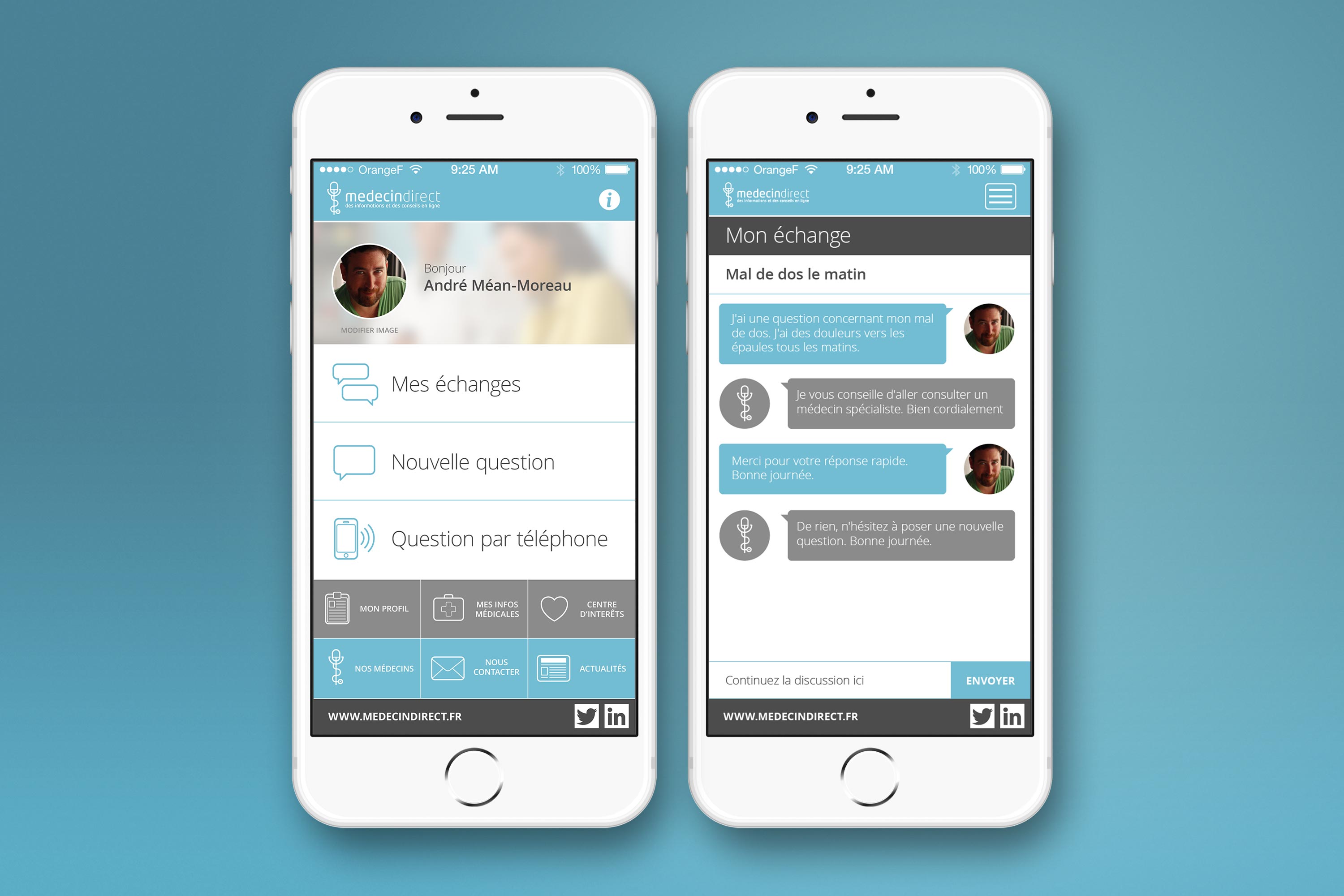
MédecinDirect AppUX Design

Art Deco Christmas CardsIllustration
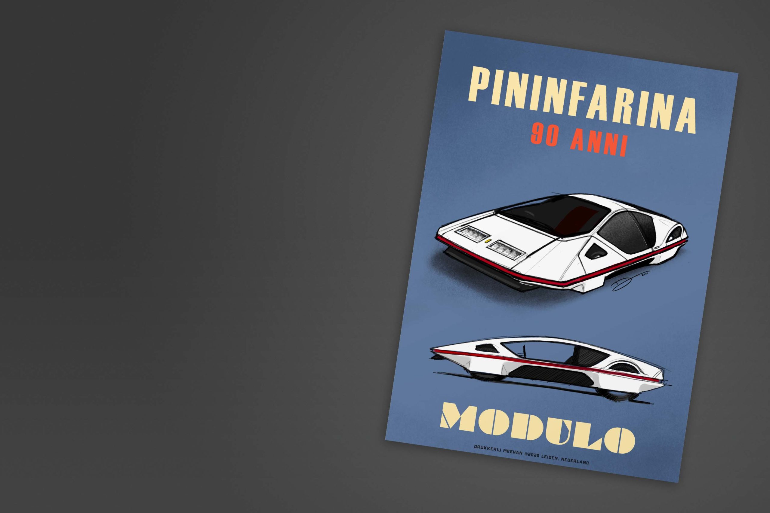
Retro Automotive PostersIllustration

