Designing smart
e-health
Designing smart
e-health
MédecinDirect App
User Experience Design
Médecin-Direct App
User Experience Design
Breaking down barriers
When telemedicine startup MédecinDirect started their business, a phone call was still the only practical way for users to communicate with the remote doctors who were working for the service. When the decision to build a smartphone app was made, it was clear that the app had ot carefully tread the line between a secure service and a place that users felt comfortable having (often sensitive) conversations with doctors they had never met. The decision was made to highlight the built-in online chat function, but also to keep the option to simply call directly in the main menu.

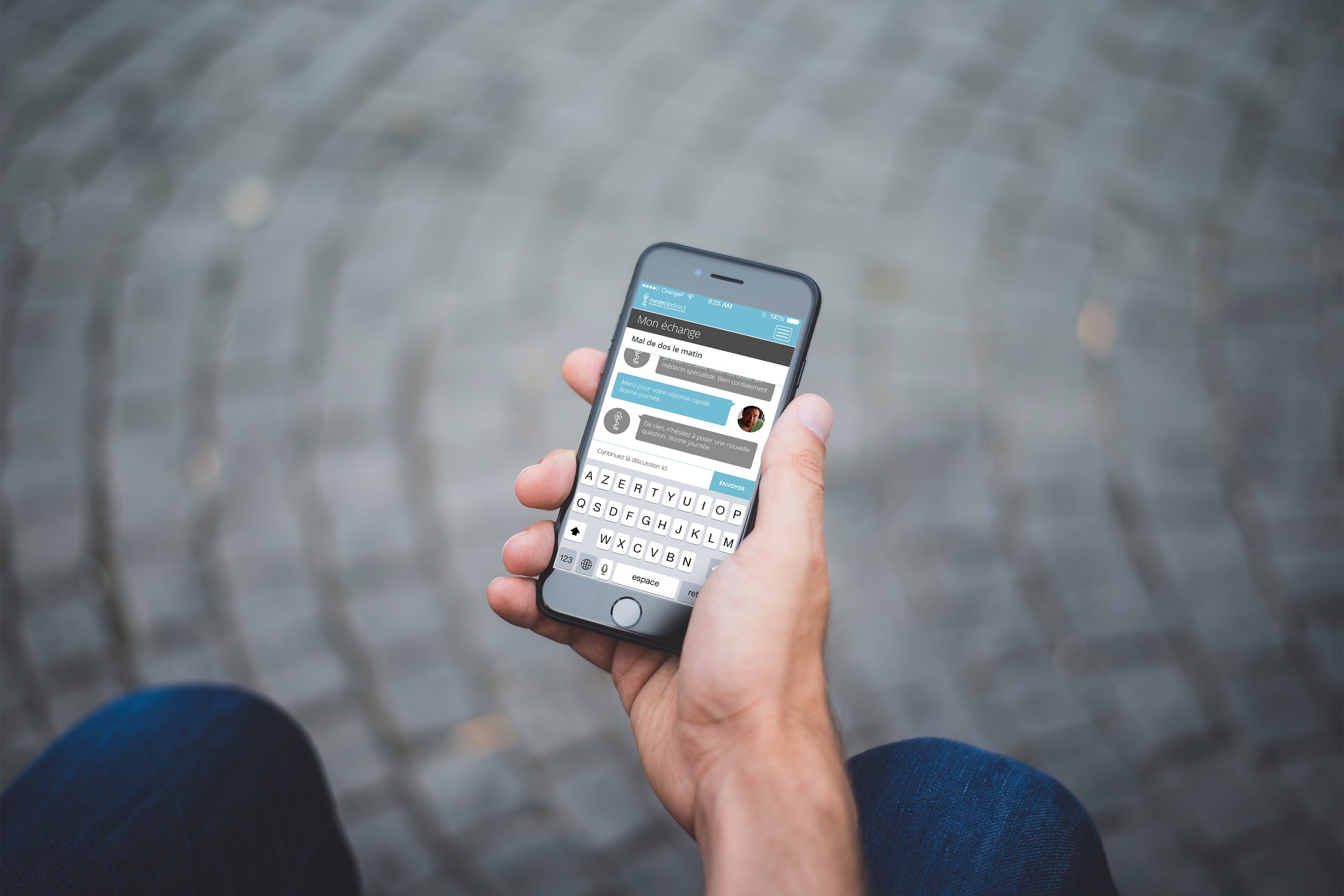
A culture of care
By creating profiles for both users and doctors, we created an environment of trust that some felt was missing from a purely digital dialogue. The chat area itself would be familiar to any Skype or WhatsApp user, but there was a focus placed on the organization of messages so that both current and archived conversations could easily be accessed from one screen. The ability to easily search and retrieve archived messages was particularly important for patients and doctors dealing with multiple chronic or recurring ailments, so that the thread of conversations would be continuous and not broken. For the doctors, the conversations were accessed via a web app that could be used in a browser, allowing their telemedical consultations to happen alongside their in-office patients.
Colors were chosen to be simultaneously modern and calming. MédecinDirect needed to be seen as a competent provider and not a fly-by-night startup that would be met with scepticism. At the same time, there was a conscious desire to not make the app feel overly "medical", eliminating red for all but the most important emergency situations.
Some of my other projects

Sympad AppUX Design
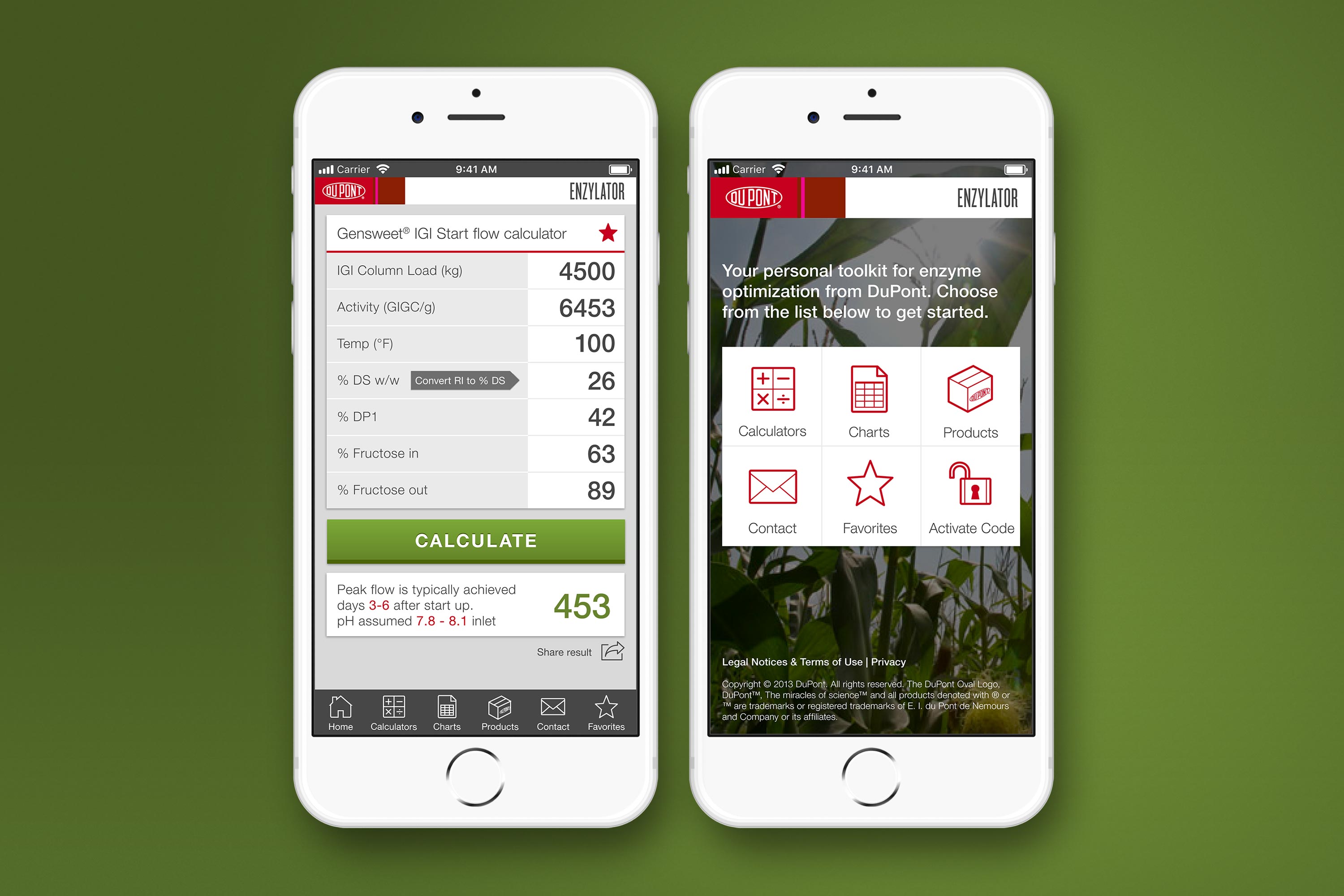
DuPont Enzylator AppUX Design
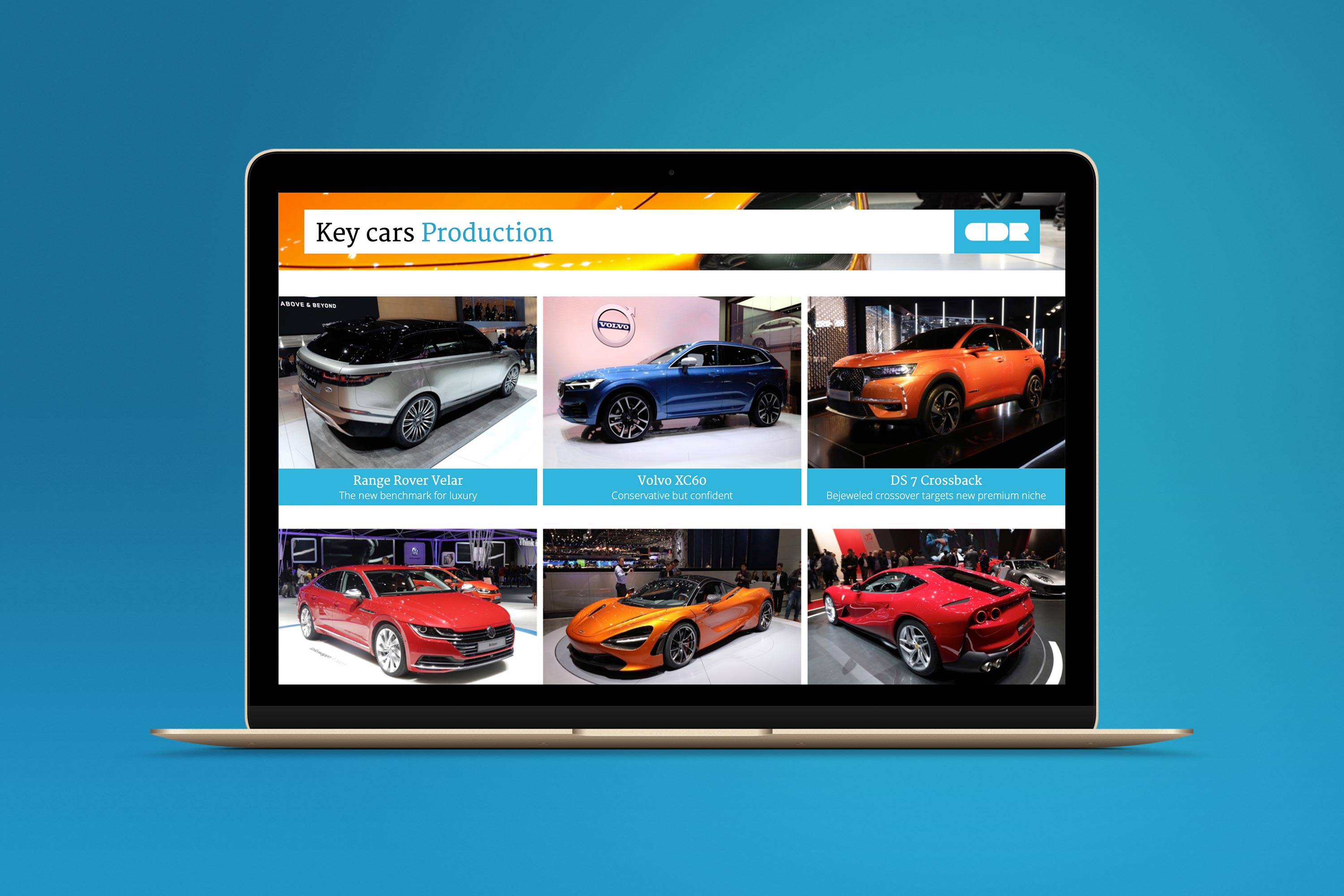
Car Design Research Design SystemUX, Branding, Presentation Design
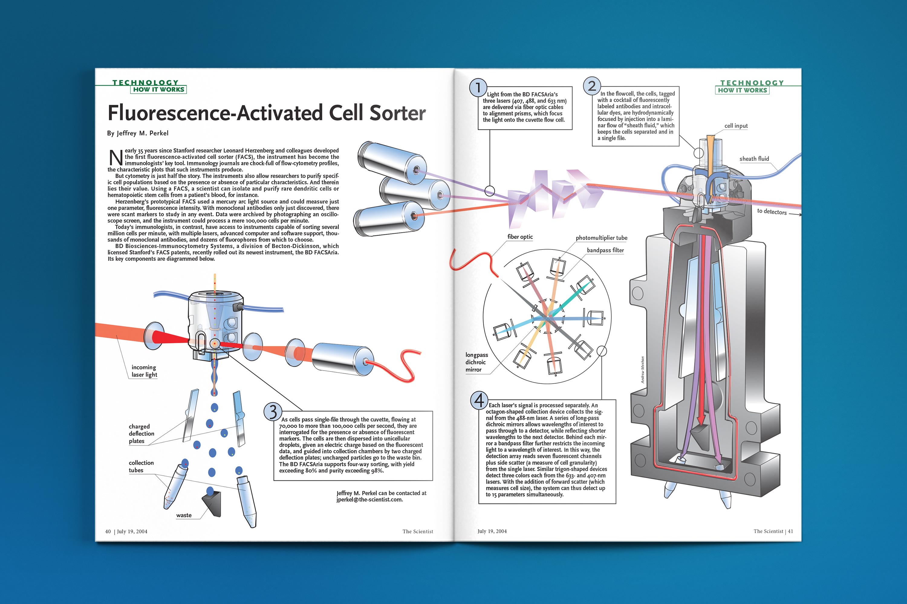
The Scientist - How It WorksTechnical Illustration
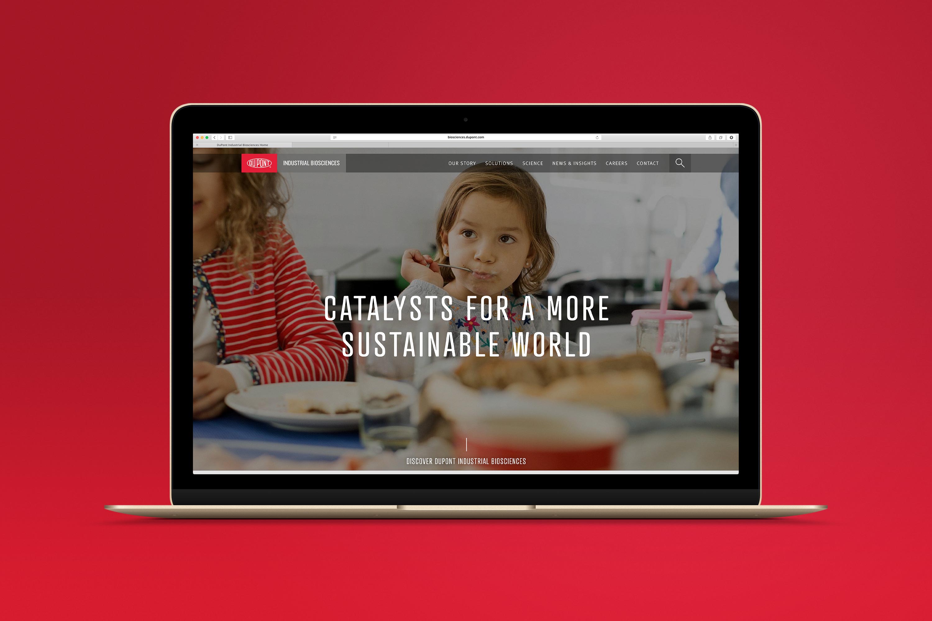
DuPont Industrial Biosciences websiteUser Experience, Product Design

Art Deco Christmas CardsIllustration
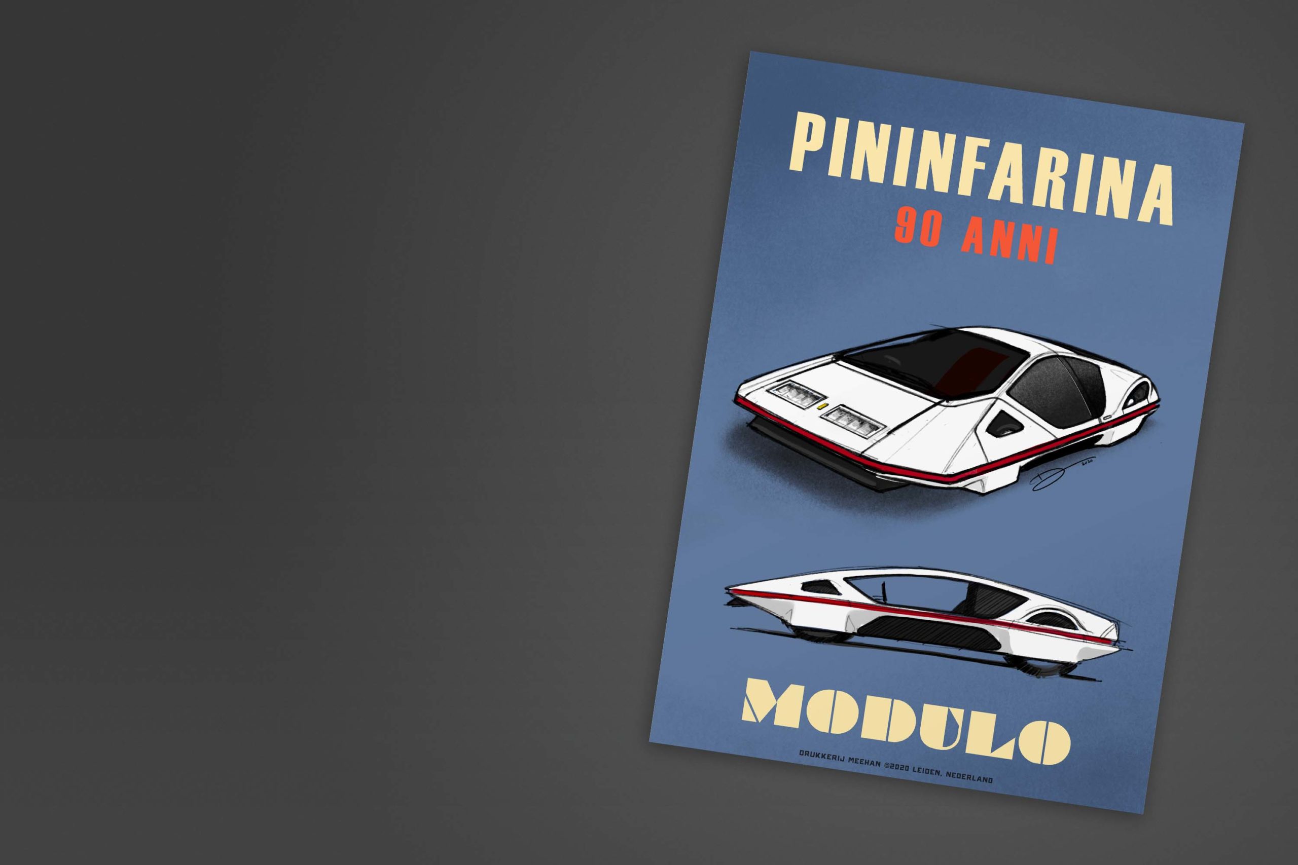
Retro Automotive PostersIllustration
