This is the introduction video for a French healthcare startup called Sympad. I designed the logo and branding guidelines for the company and created the video production implementation of the brand seen here.
Icons created for multiple releases of Neat Receipts software for both Mac and PC. You see here the original exploration concepts, as well as the final icon set that is currently used in NeatReceipts Mac 3.0 and the recent Neat 5 release. With this icon set I continued the integration of the two formerly disparate products into one cohesive visual product line.
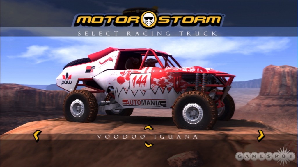
Actual gameplay screen grabs of vehicles that I designed for the original MotorStorm game on PS3.
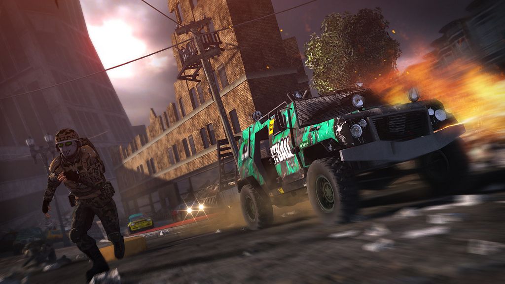
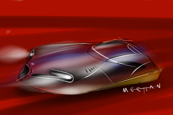
Military vehicle designed for Sony Computer Entertainment Europe and Evolution Studios. Official pre-release press image courtesy of Sony.
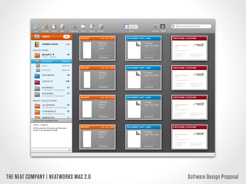
Proposed design solutions for The Neat Company's NeatWorks for Mac version 2.0.
Final icon set for NeatReceipts/NeatWorks 2.0 for Mac.
A series of exploratory icons created for the first release of NeatReceipts for Mac in 2008.
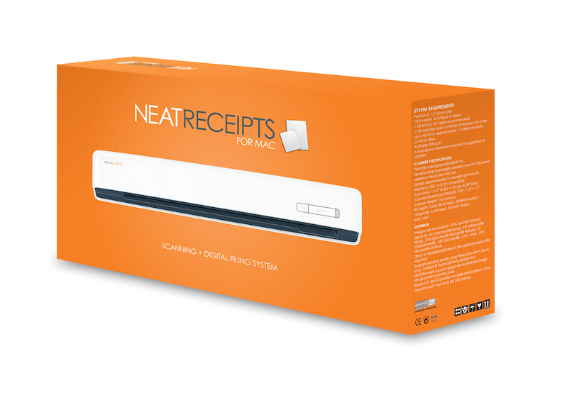
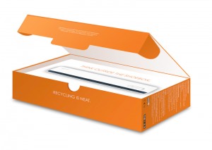
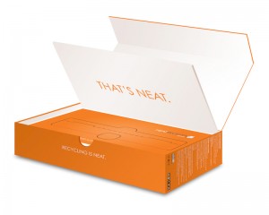
I designed the original logo and packaging for The Neat Company's first release of NeatReceipts for Mac. Designed to stand out on a busy shelf while staying true to the clean and modern aesthetic that Apple owners expect.
Check out Carl Alviani's article about it on Core77, and I'll be putting up my impressions soon.
Autodesk sent out a press release yesterday about all the love it's getting in the Mac community, and guess what? They quoted me. As "a creator of iconic technical illustrations"
Nice. Thanks Autodesk.
Car magazine has long been one of my most cherished and revered sources of car news, photographic inspiration and cutting-edge design. Published in the UK, I have been spending my hard-earned cash on the import-priced glossy loveliness for almost 20 years now. Not anymore. Car has gone and done the unthinkable—they've dumbed down the design to blend in, rather than stand out, from the crowd.
Just a few years removed from one of the most stunning and gorgeous magazine redesigns I've ever seen, they've basically reverted to clichéd tacky Euro auto-weekly style. Busy covers, red box around the logo, smaller size, cheaper paper and nasty typography have replaced the lusciously high-end look of the past two years, bringing a tear to my eye. They've even gone and done the same thing to their website, one of the most intricately laid out sites around.
Is it the new depression's fault? Maybe. But the price hasn't gone down with the quality, so I somehow think that if this is a cost-cutting measure it's well on the road to massively backfiring. Will readers forgive and forget? Maybe, but longtime lovers and subscribers like me probably won't, and the last thing a high-end monthly publication needs now is losing subscribers. When you start stating that you the "World's best car magazine" right in the header, it's a sure sign that you're not anymore.
Tim Pollard, the editor of the magazine, has been campaigning hard for the new look, saying that it's simply "in response to reader feedback." Judging by the hundreds of negative comments on the website I'd say they may have asked the wrong readers, and it seems they'll be losing some lifers with the change. Maybe he's ok with that, or maybe it was forced on him by the mag's new owners, but either way, it's a sad day when a design beacon sells its soul for sales. A sign of the times I suppose, but I won't be renewing my subscription.
Bring back the design edge Mr. Pollard, and I'll gladly drop the £65 to re-up my subscription and put Car back on my coffee table where it belongs.
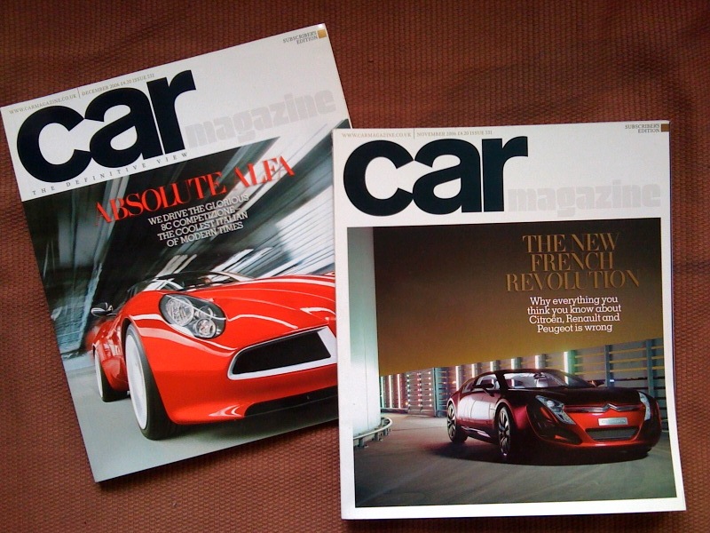
Gorgeous previous redesign of Car
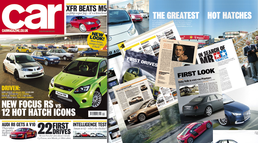
Newly redesigned Car magazine

