Responding to change
Responding
to change
Responding
to
change
DuPont Industrial Biosciences Website User Experience
DuPont Industrial Biosciences
Website
User Experience
Seeing the big picture
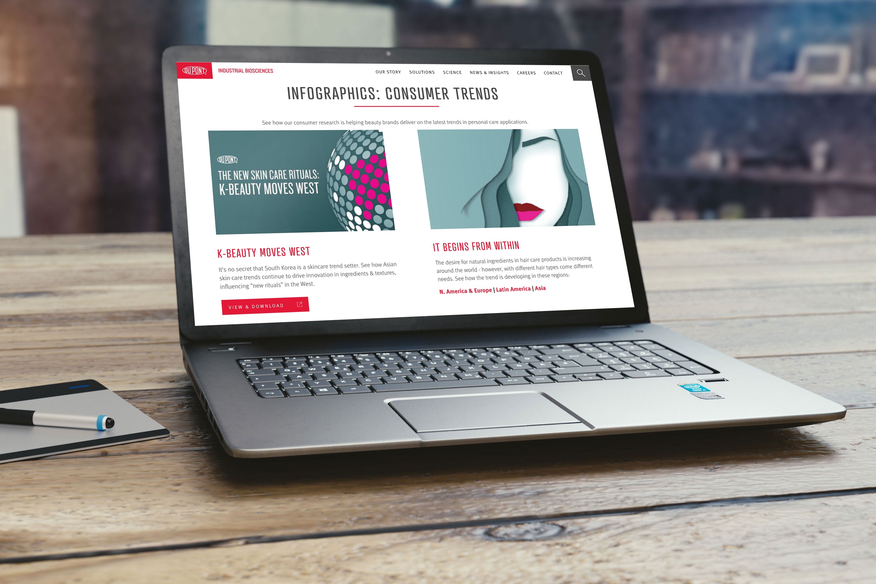
DuPont Industrial Biosciences needed to build a modern, responsive website to help them raise their profile and better manage an upcoming merger. I worked with their own digital team and external developers to create a site that would be responsive to screen sizes and also to business needs. From the outset, the goal of the project was to develop an experience that would be user-friendly for both front-end and back-end users, and allow individual businesses to re-skin a set of base components for their individual brand needs. To compound the pressure of the project was the announced merger with Dow, meaning that any design would likely need to be re-branded within a short timeline, and likely merge new businesses into the site — all with minimal hassle and maximum flexibility.
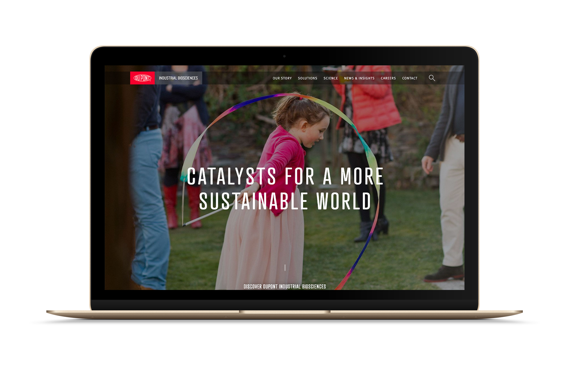
Breaking it down
By wireframing the overall layout , we finalized a set of "content blocks" to be fully styled and developed. These content blocks were created to maximize compatibility with existing and future business needs, with dozens of page mockups created to explore the limits of the available styles for current and future use. Pixel-perfect mockups were created for over 100 different on-screen elements and content blocks, as were bespoke icon sets and a style guide for final development. I then provided detailed CSS and design guidelines to the development team for final build of both frontend and backend site.
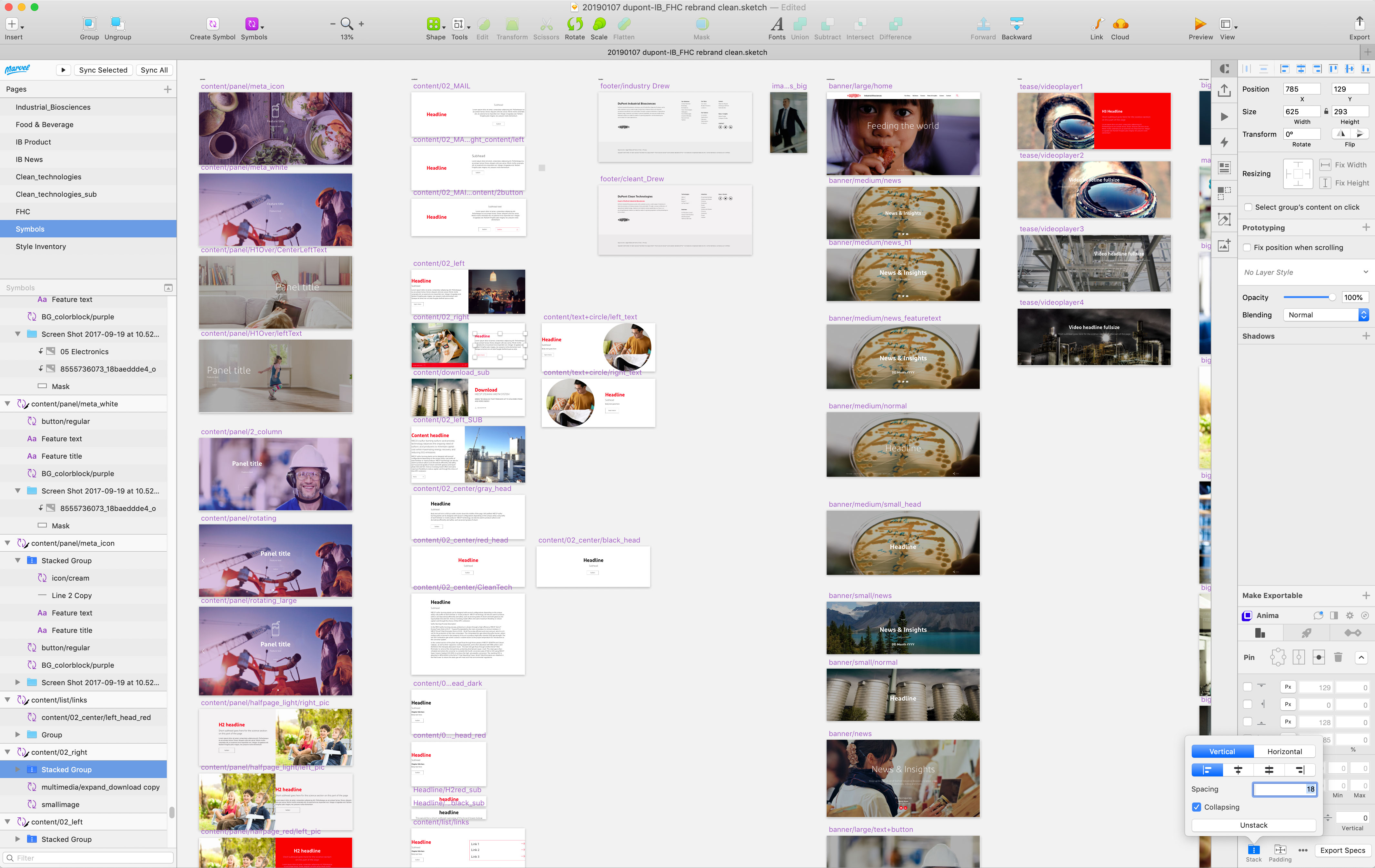
The Sketch file for the site shows how the many elements function together
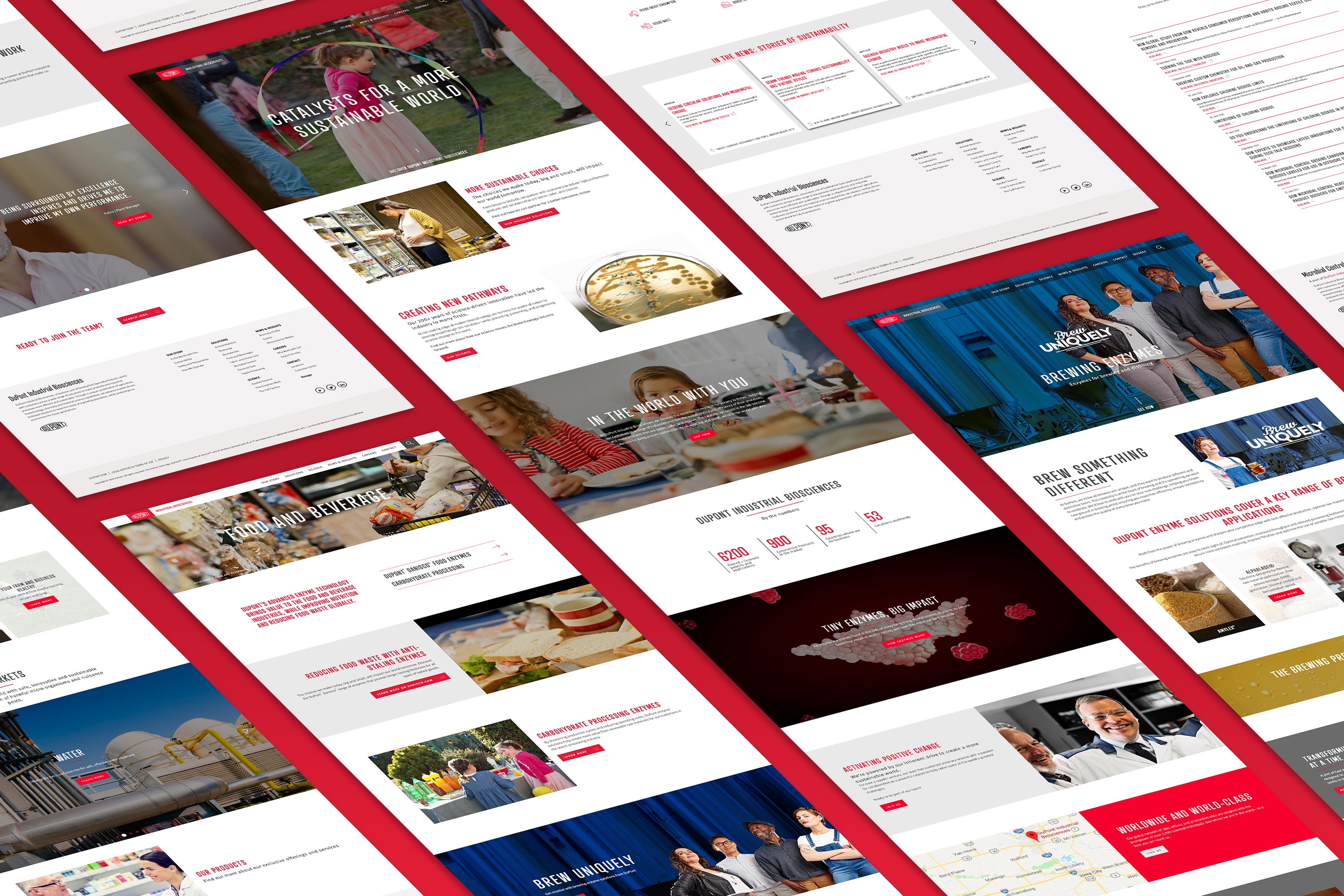
By using a core set of carefully-designed content blocks, we faciliated the creation of a huge variety of pages and styles
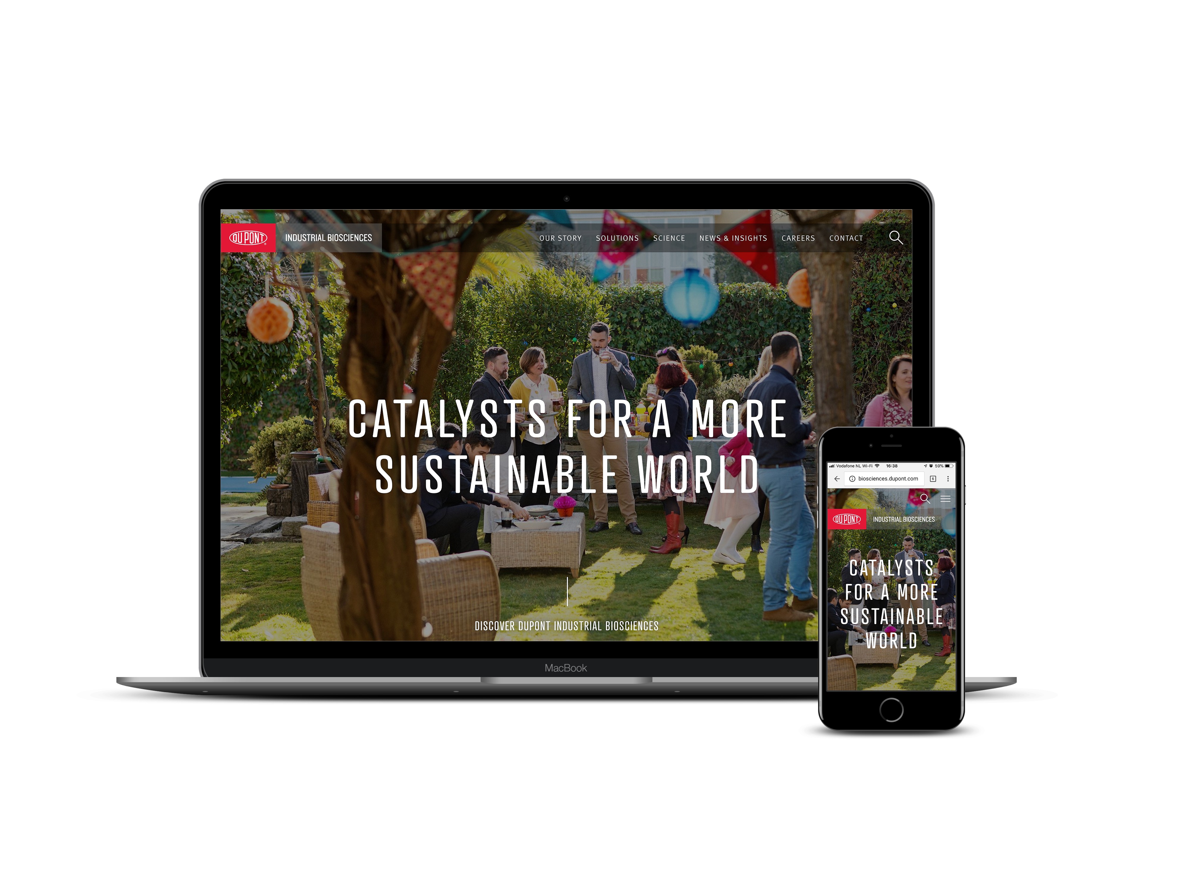

More than skin deep
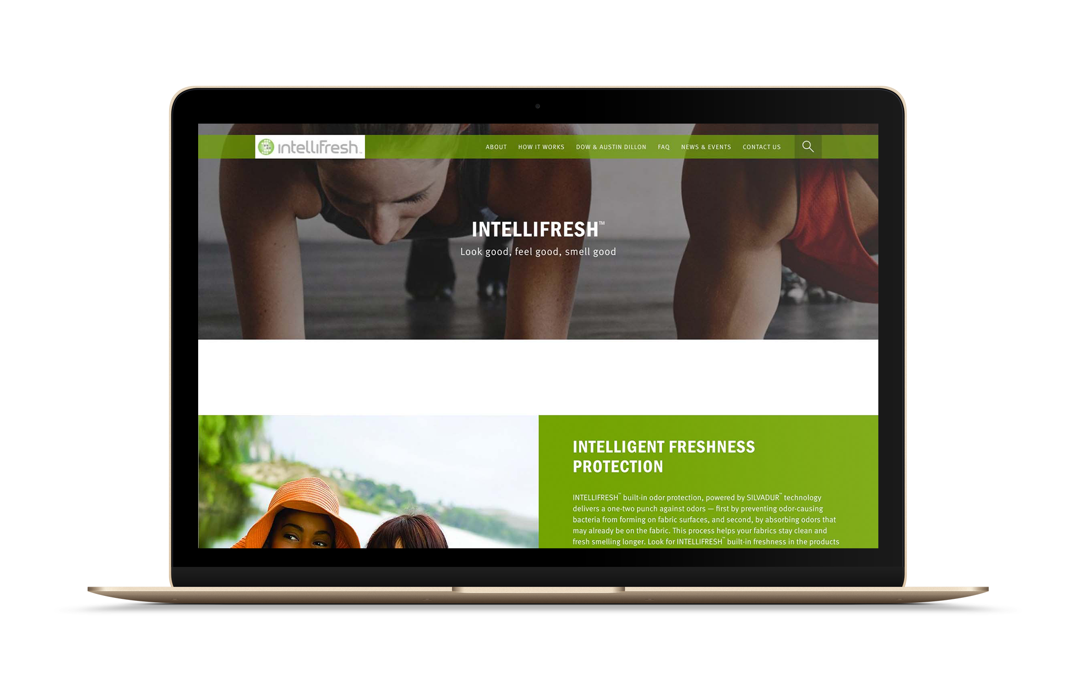
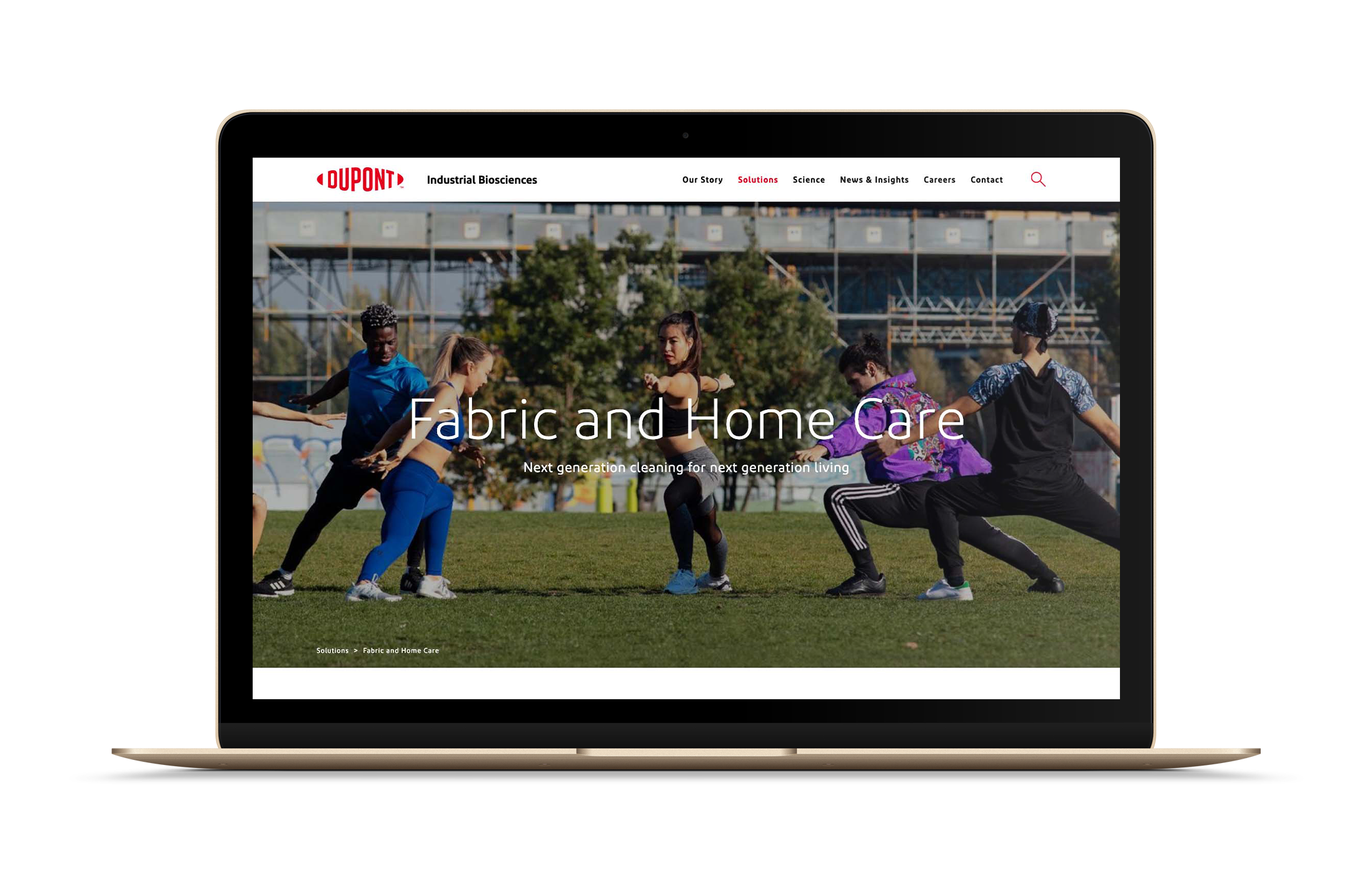
By creating the site as a templated series of blocks and styles, it was easy to re-skin the site for other businesses and brands within Industrial Biosciences. Within a few months of the site launch in 2017, several other businesses had applied their own branding and styles to create bespoke versions of the site that was familiar to their customers, but identical to manage in the backend CMS. In January 2019, the Fabric and Home Care business pages were used as a launchpad for the new DuPont branding that was announced just a few months before. I was able to completely restyle the site in just a few weeks, proving that the design would provide a solid foundation for the company as it moves forward into the future.
Some of my other projects

Sympad AppUX Design
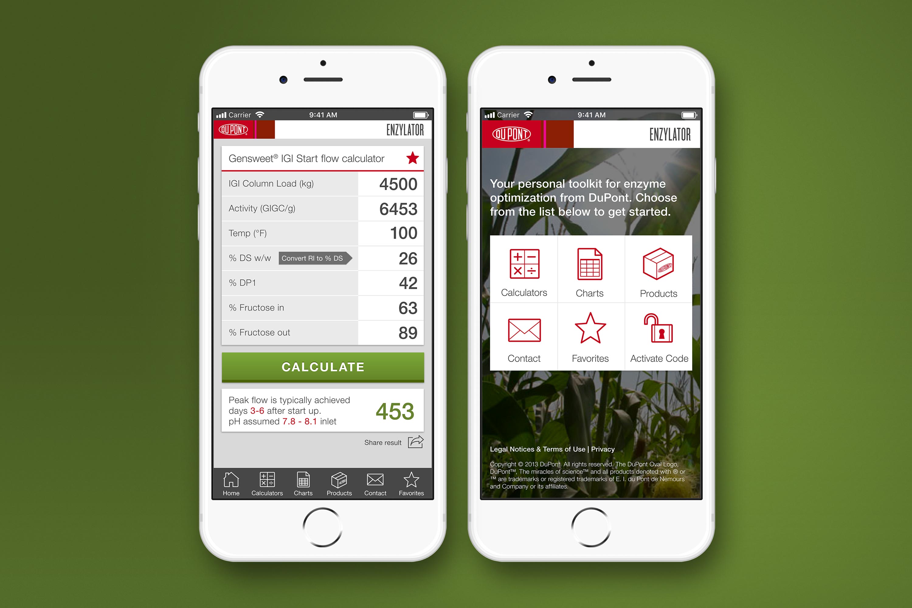
DuPont Enzylator AppUX Design
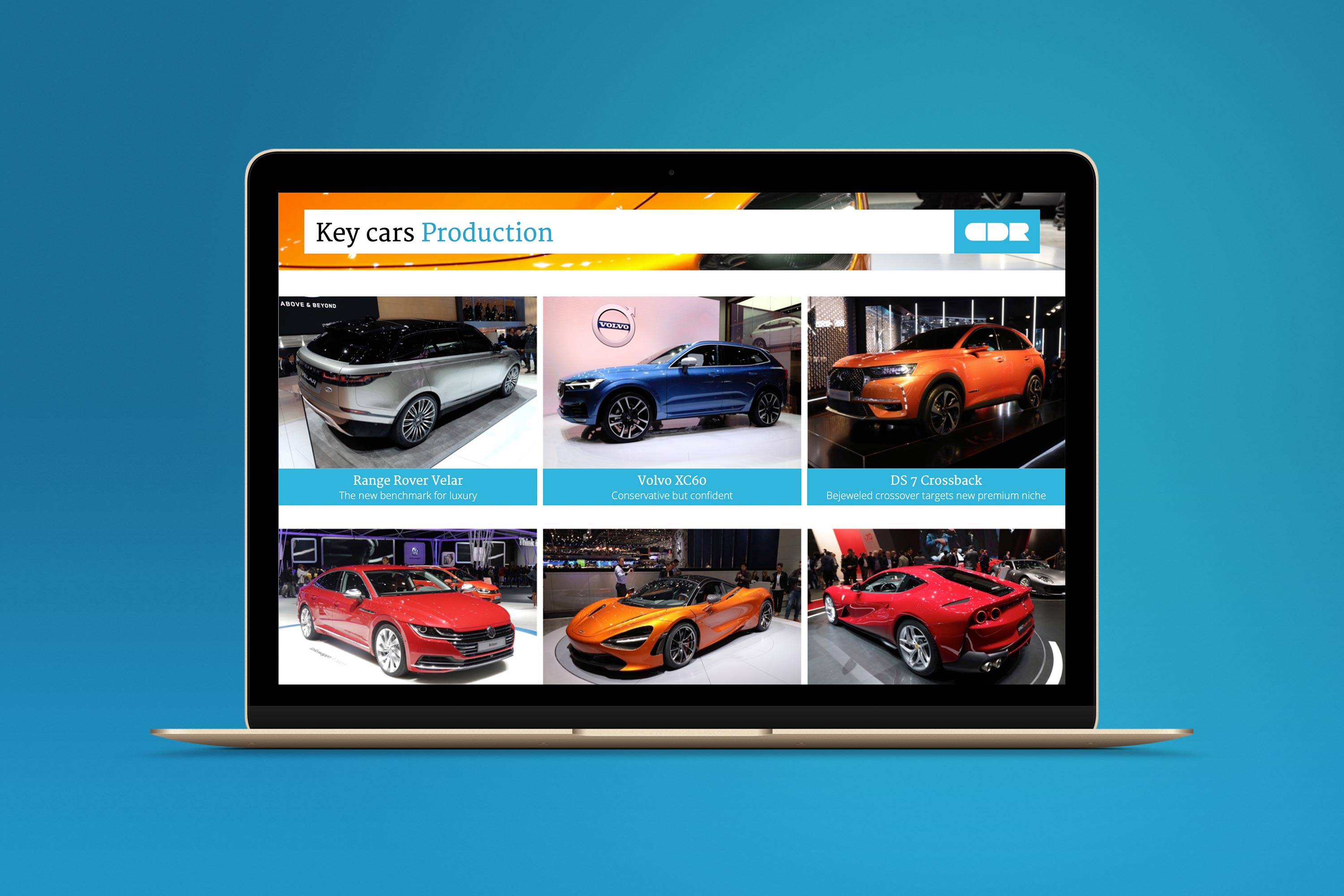
Car Design Research Design SystemUX, Branding, Presentation Design
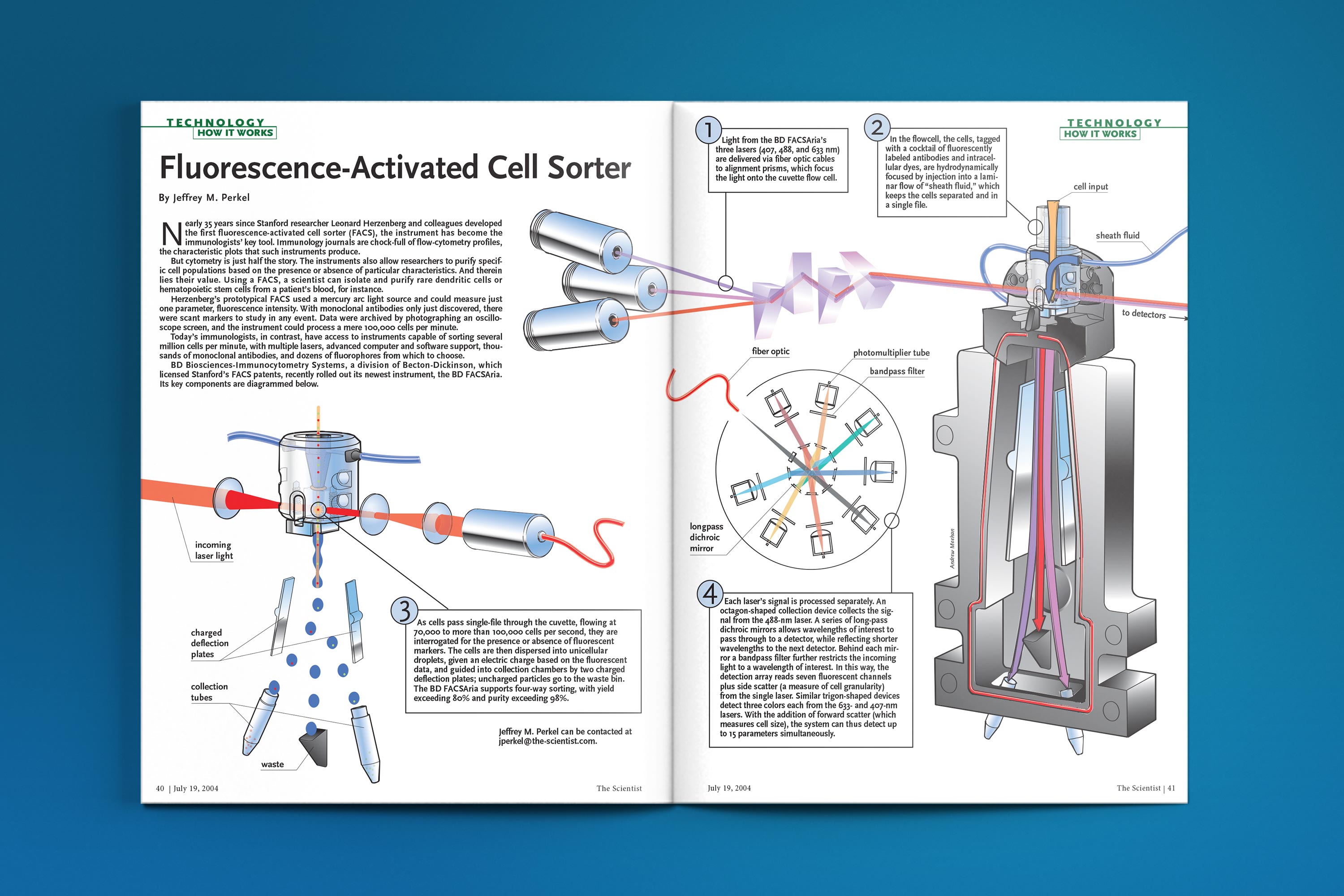
The Scientist - How It WorksTechnical Illustration
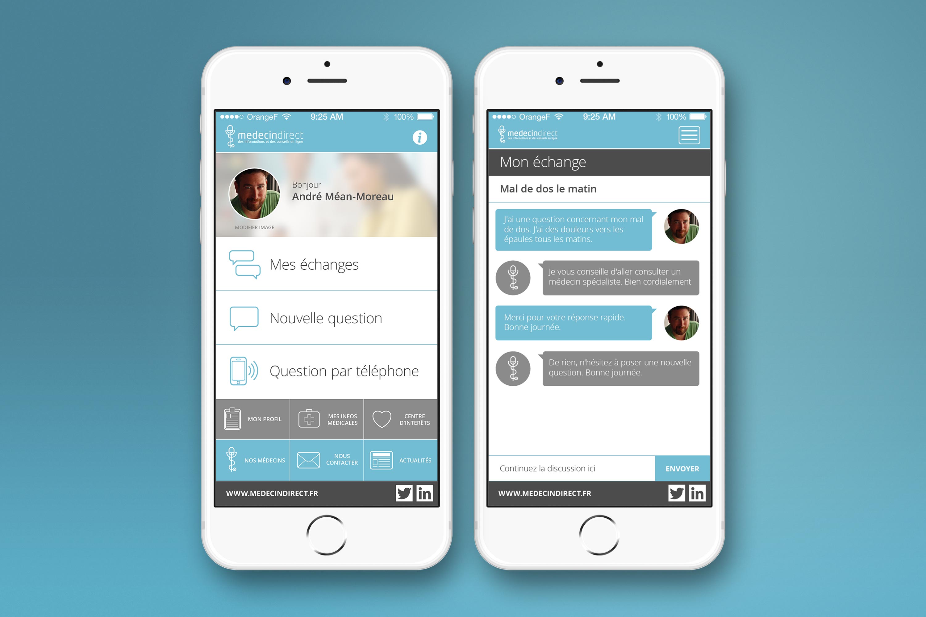
MédecinDirect AppUX Design

Art Deco Christmas CardsIllustration
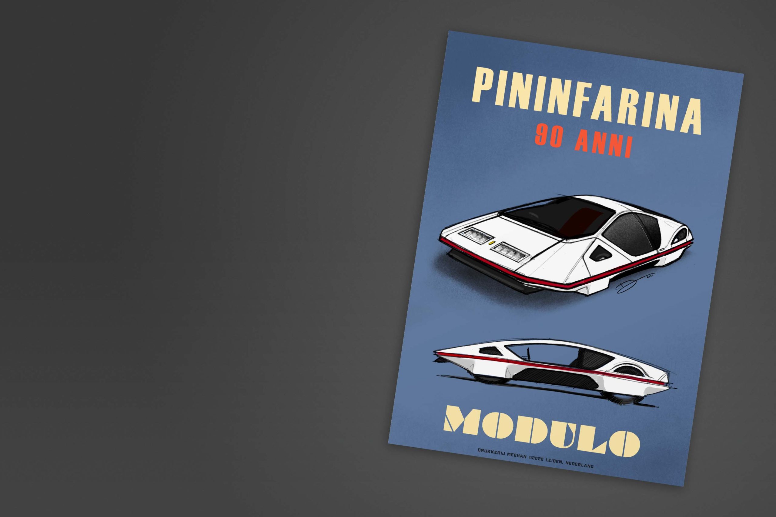
Retro Automotive PostersIllustration
